As Senior UX/UI Designer at HIVE Strategy, I led the end-to-end design process, from research and UX strategy to final high-fidelity designs. I created all design assets, conducted audits of the current experience, mapped user flows, built personas, and established the information architecture and visual direction for the new company’s digital platform.
Client:
Gordon Flesch Company
Partners:
HIVE Strategy
UX Strategy, UX Audit, Heuristic Analysis, Persona Creation, User Journey Mapping, User Flow Analysis, Information Architecture, Sitemap Redesign, Navigation Design, UI Redesign, Enterprise UX, B2B Web Design, Design Leadership, Interactive Prototypes, Design Strategy.
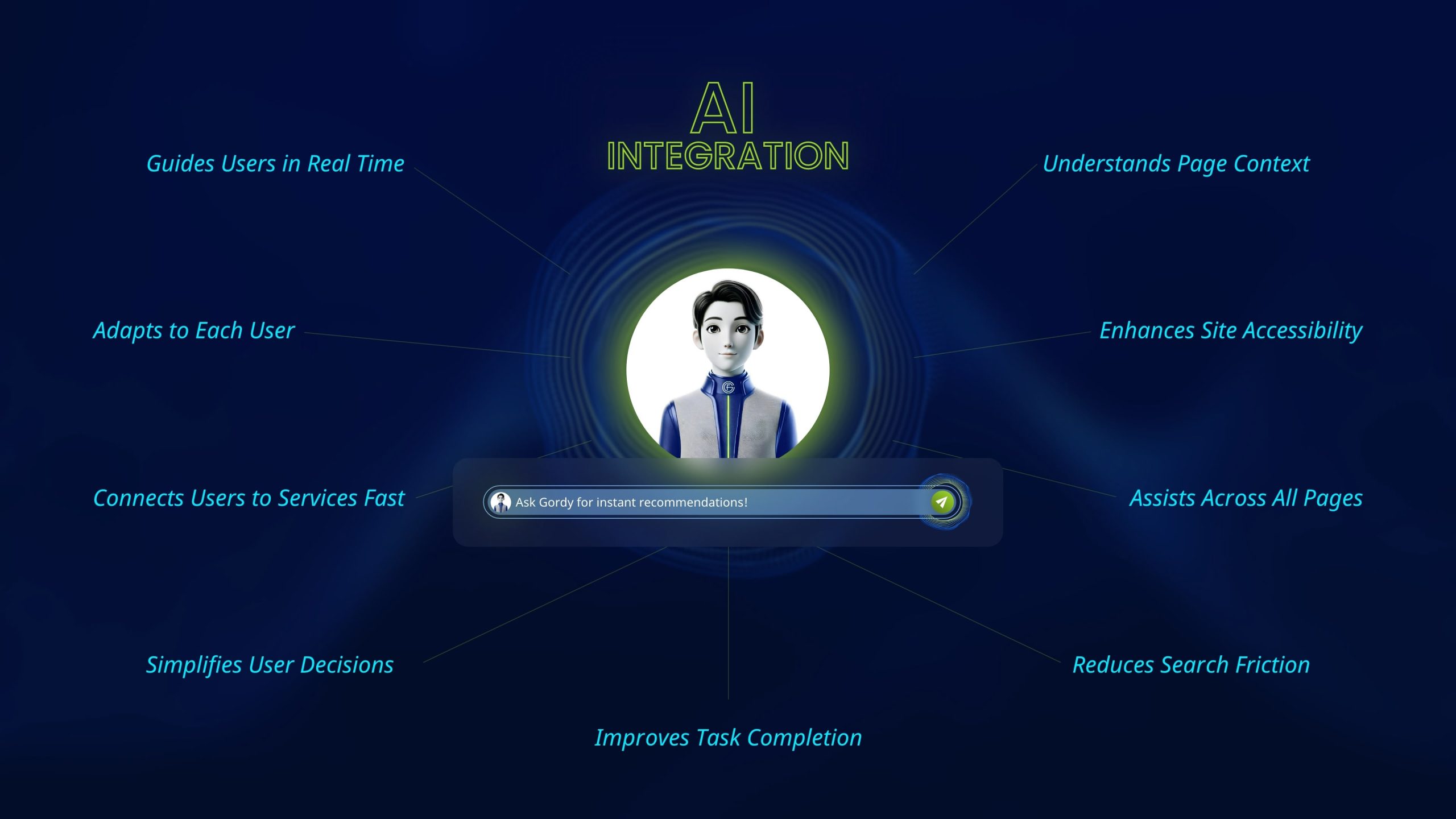
Gordy AI Assistant – Enhancing the User Experience
At the core of the Gordon Flesch redesign is Gordy, an AI-powered virtual assistant that redefines how users interact with the website. Designed from the insights uncovered during UX research, Gordy was built to solve one of the most common frustrations, users struggling to find the right service, support, or information path quickly. By integrating Gordy into the site’s architecture, the experience became more intuitive, personal, and self-guided. Whether a visitor is exploring solutions, reading blogs, or seeking technical help, Gordy delivers real-time recommendations, guiding them to the right content in fewer clicks.
Project Goal
The redesign focused on improving usability and clarity across the Gordon Flesch website. The main goals were to simplify complex navigation, make it easier to distinguish between technical and service support, and introduce the “Gordy” AI assistant to enhance the overall user experience with smarter, more personalized interactions.
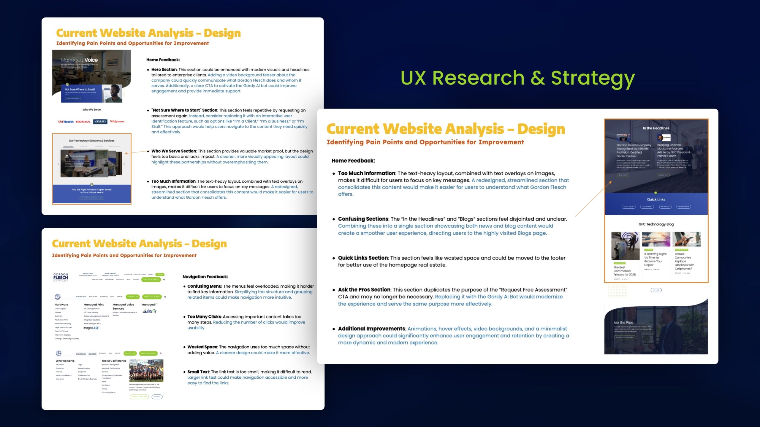
UX Research & Strategy
The process began with a full UX audit and heuristic analysis of the current Gordon Flesch website. I identified key usability issues including complex navigation, low-contrast CTAs, and excessive cognitive load from text-heavy layouts. This phase uncovered the foundation for improvement, simplifying structure, enhancing hierarchy, and clarifying user pathways for enterprise and SMB audiences.
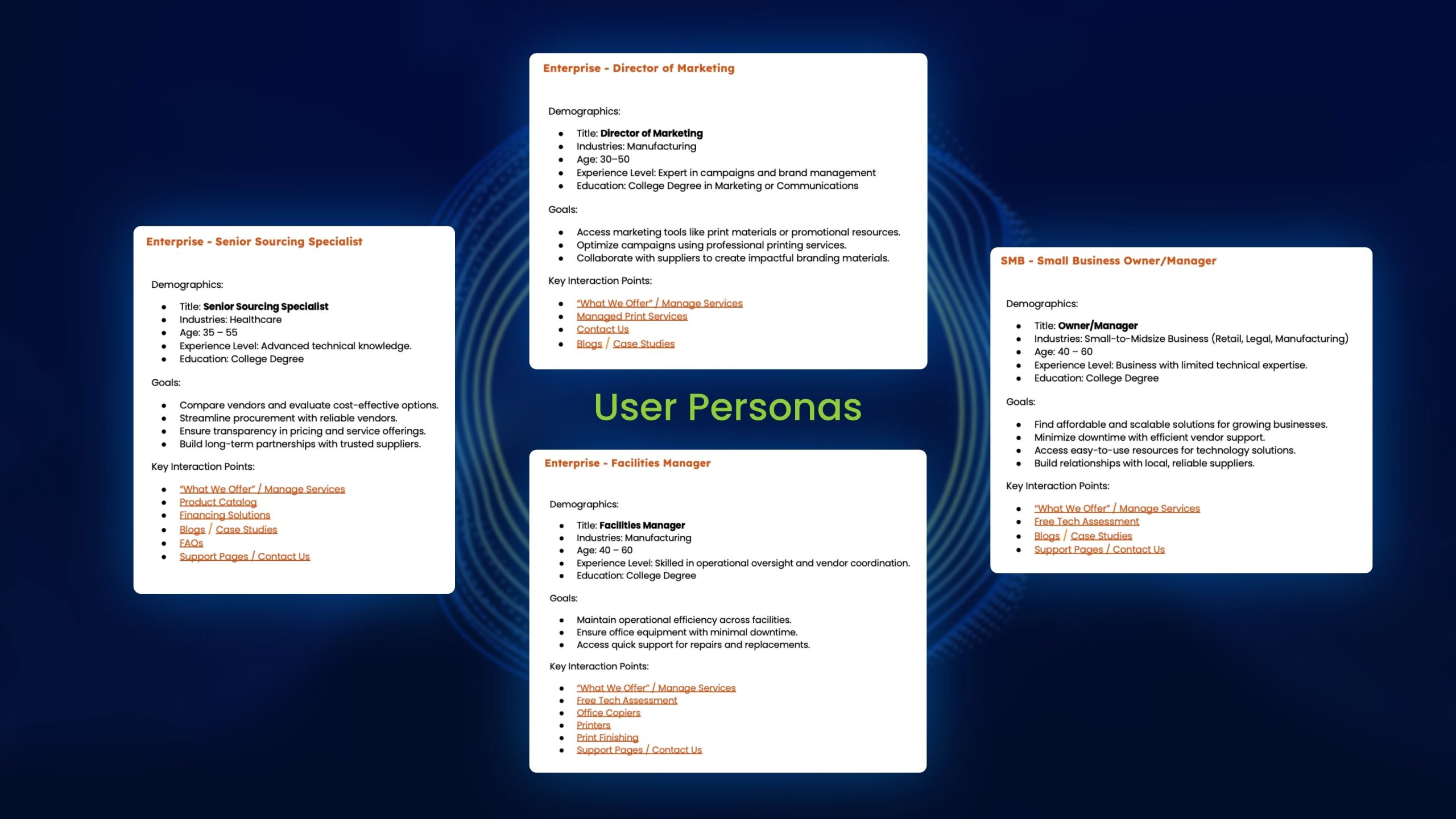
User Personas
Based on research, I created five detailed user personas representing key customer types from enterprise IT directors to small business owners. Each persona included goals, frustrations, and interaction touchpoints, shaping design decisions that prioritized accessibility and tailored pathways through the website.
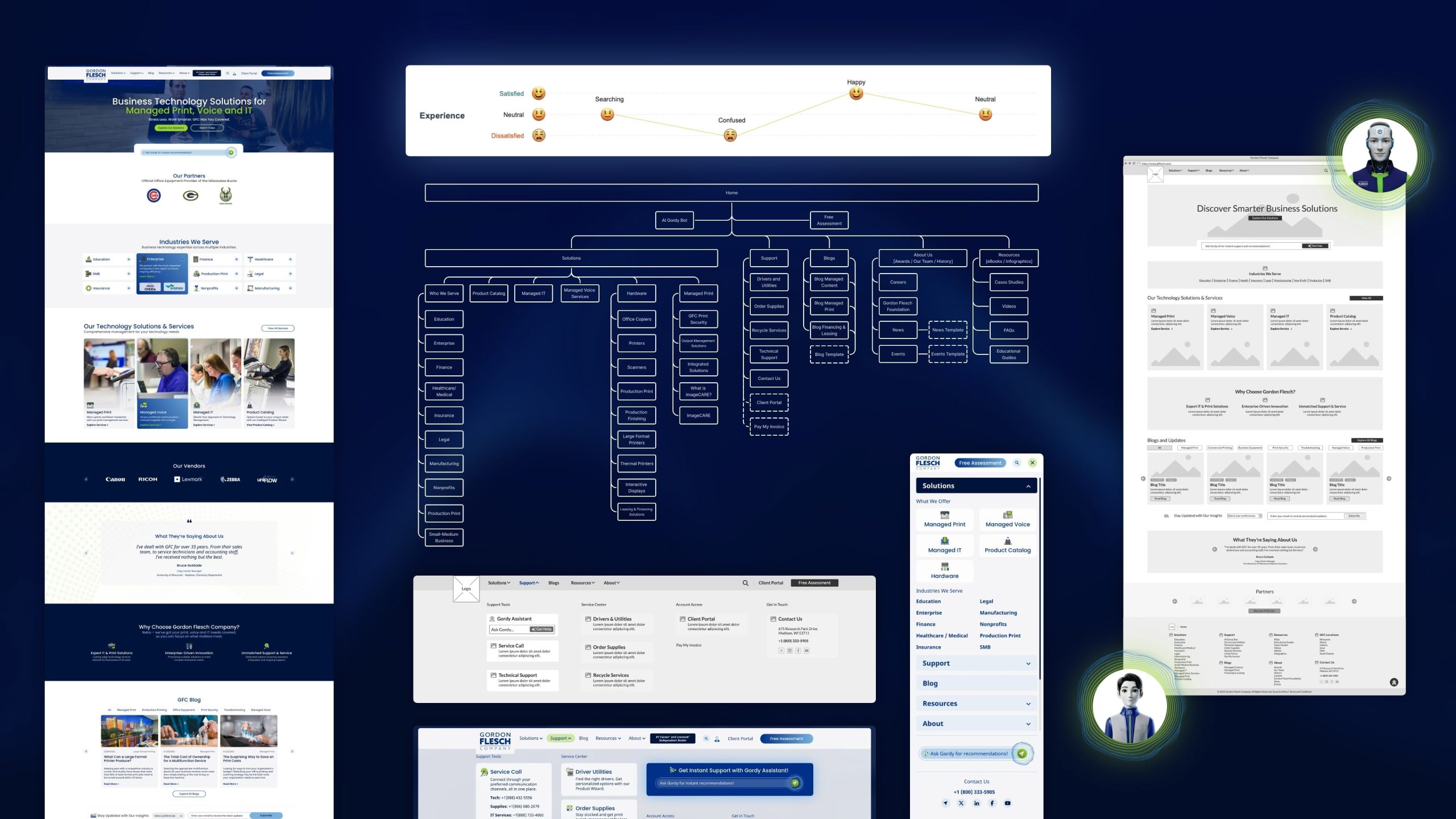
User Journey Maps
Journey maps visualized how each persona interacted with the current site. They exposed pain points across stages like discovery and decision, revealing confusion around navigation and weak CTAs. Mapping emotions (satisfied, neutral, confused) guided opportunities to simplify flows and integrate AI-driven support via the Gordy Assistant.
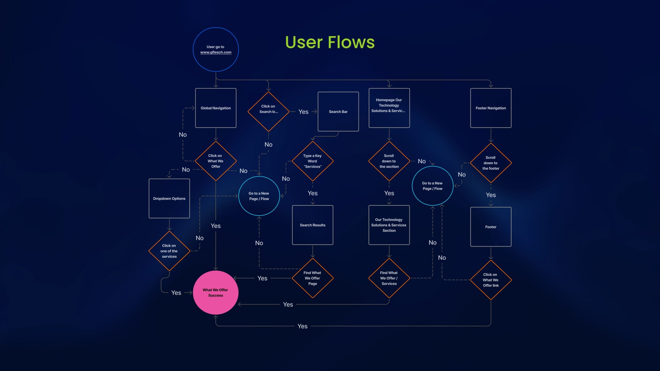
User Flows
The user flow analysis uncovered fragmented navigation with multiple redundant paths. By restructuring it into a single streamlined flow for tasks such as “Accessing What We Offer,” I reduced friction, clarified actions, and improved the time to reach critical pages, a key win for conversion efficiency.
Site Architecture
The redesigned information architecture organized content under a simplified global structure: Solutions, Support, Blog, Resources, and About. This new sitemap aligned with GFC’s 80/20 business focus, ensuring enterprise-level content appeared first and navigation remained intuitive across all user segments.
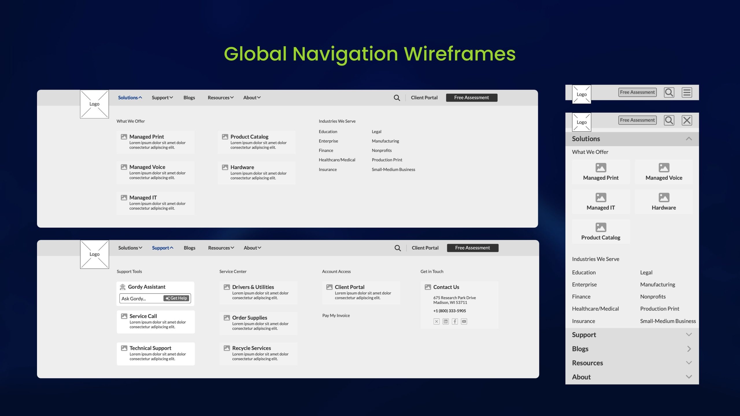
Website Wireframes
Wireframes translated research insights into structure. They focused on clarity, modularity, and hierarchy, placing CTAs consistently, introducing the Gordy AI section for quick support, and reorganizing content blocks to help users find key information in fewer clicks.
This phase refined the navigation experience across desktop and mobile. By grouping related items, emphasizing hierarchy, and introducing predictive search, I reduced cognitive load. Gordy Assistant was integrated directly into the navigation to provide context-aware support and fast access to tools.
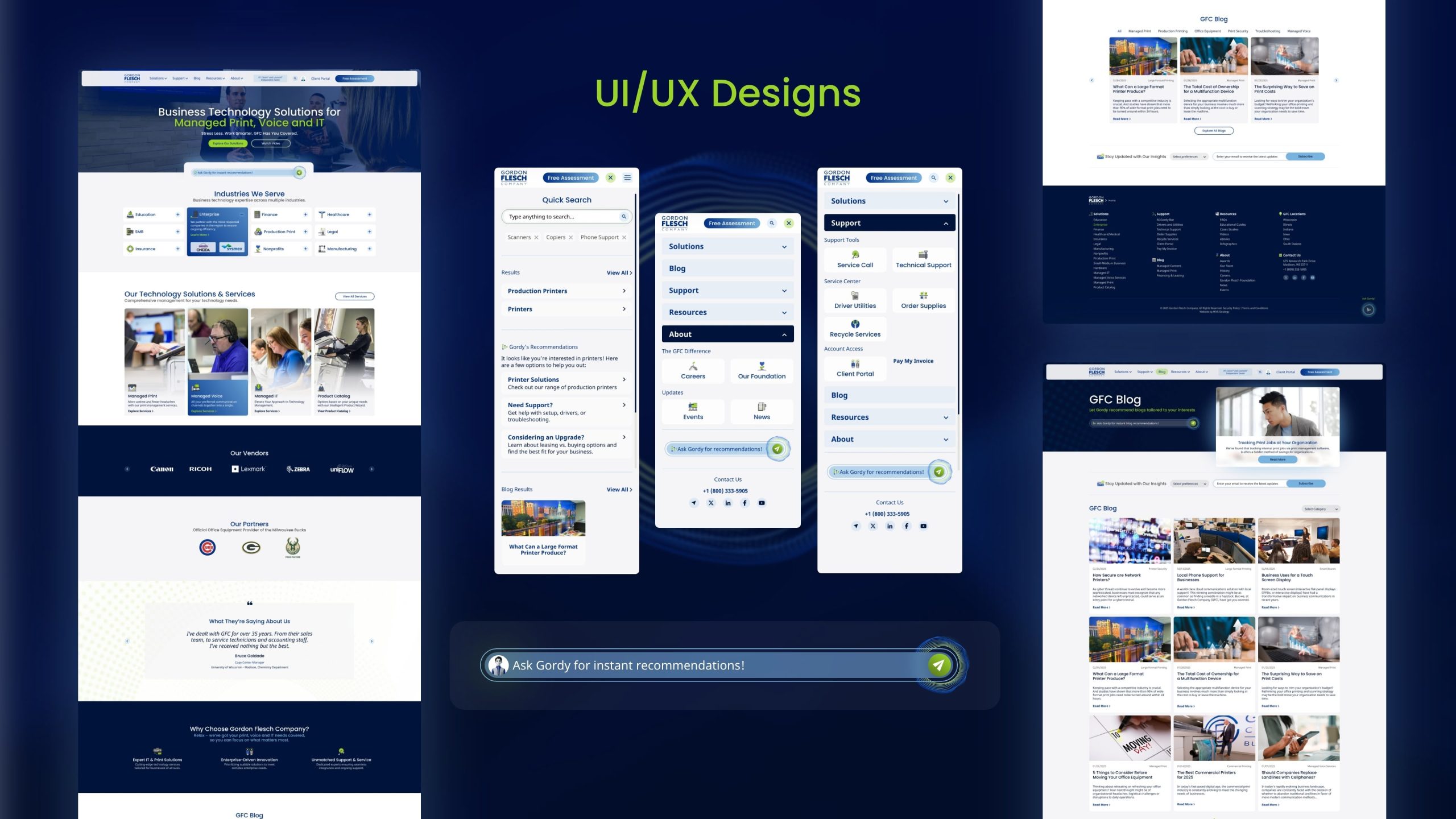
UI/UX Designs + Prototypes
The final high-fidelity UI combined functionality with a refreshed aesthetic. A dark-blue visual system communicated innovation and trust, while consistent spacing, typography, and iconography reinforced clarity. The result was a cohesive and scalable design system optimized for the users.
Interactive prototypes validated the new experience. They showcased simplified service categories, clear CTAs, and contextual AI guidance. These mid-fidelity designs were tested internally to confirm flow logic and ensure the design effectively met user goals before moving to visual polish.
Conclusion
The redesign successfully transformed the Gordon Flesch digital experience into a more intuitive, structured, and intelligent platform. By integrating Gordy, the AI assistant, the website evolved from static navigation into a dynamic, conversational experience that adapts to user intent, provides contextual guidance, and personalizes content discovery. The result is a human-centered, accessible, and efficient experience that helps users find what they need faster while reflecting GFC’s commitment to innovation and service excellence